Chicken and Biscuits
This project was in collaboration with Wayne State’s Theatre and Dance Department for their 2024 season.
#posters #layoutdesign #print #typography #digitalmarketing
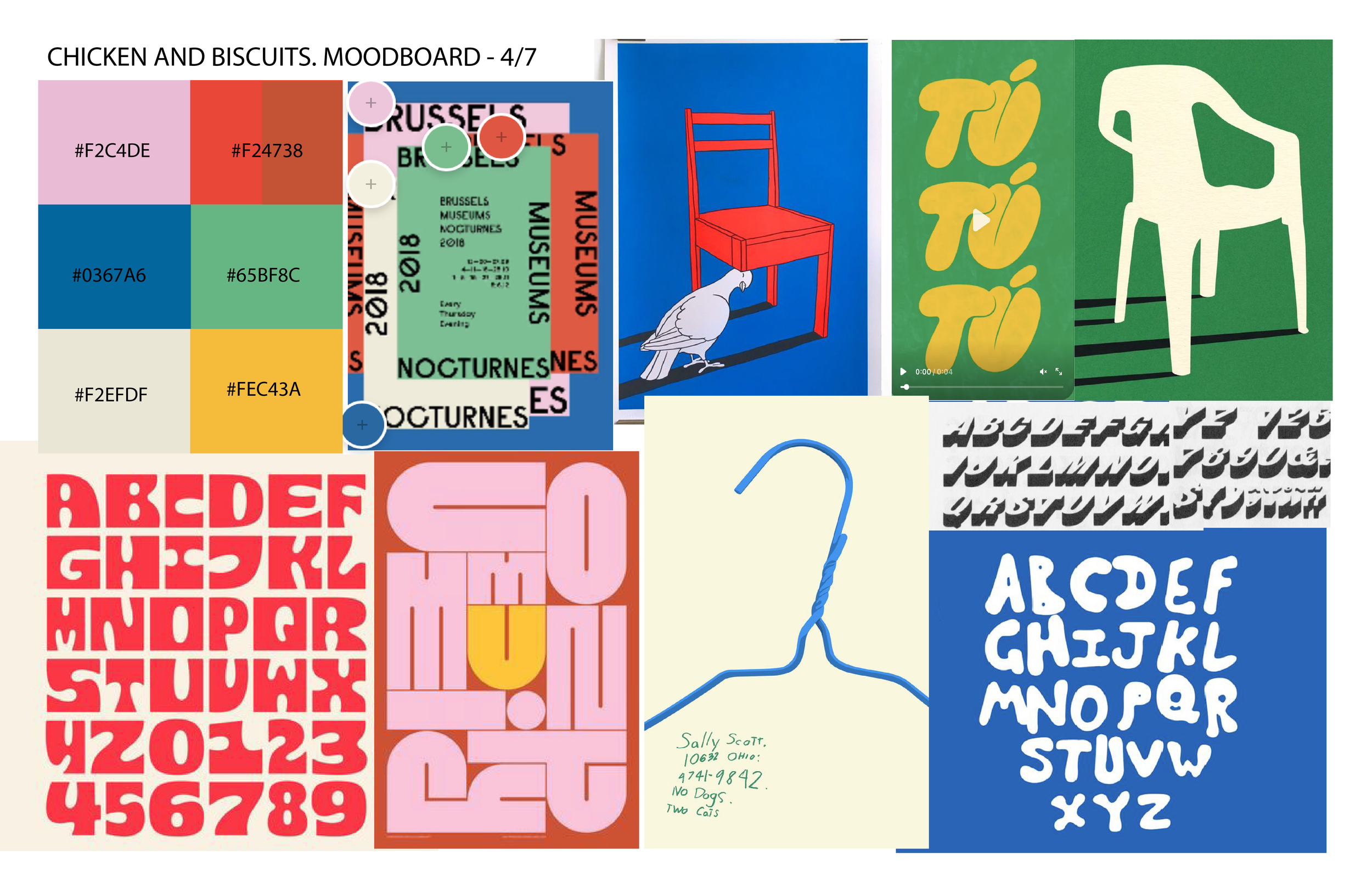
Moodboard
It was important for this project to steer away from the traditional food imagery of chicken and biscuits, and focus more on the essence of the play: family, celebration, and reunion. The choice was made to use bright colors and subtle icons to communicate the narrative.
Rough drafts
Upon talking with the clients, they wanted the icons of a funeral due to the subject matter of the play. It was later changed by the director as they requested traditional Black church hats to be included in the design.
These colors were used to convey some feeling of celebration. The assorted type in the posters was to emphasize a certain level of chaos within the family structure.
Final design


